
Getting lost in the weeds.
Focusing on the details that no one will likely notice.

I frequently use a continuous shooting mode when taking images, especially of wildlife or sports events. This means that when I press the camera button, it keeps taking pictures until I release the button. Usually, I will have it set to the lower speed setting of 5 frames a second, but sometimes I might have it on 15 or 30 frames a second.
The advantage is that it increases the chances of capturing a moment that can easily be missed using a single shutter release.
The disadvantage is that you can end up with hundreds of images to scroll through when doing the first cull and deciding which images to keep.
Most of the time, it is fairly obvious which ones are the keepers, and it is easy to discard those that haven’t made the cut.
Sometimes, there will be 2, 3 or more in a sequence worthy of keeping, and it becomes difficult to decide which one to focus on to present as the final image. Often, I will keep multiple images and make a final decision when editing.
This first cull is often a quick exercise, and it isn’t until you see the image in the editing software that you get the chance to look at the finer detail. This detailed examination may make the decision for you, as one in the sequence may stand out as the better quality picture, usually it is sharper.
Sometimes it is appropriate to present a sequence of shots to tell a story, but often I am editing for a specific project or event, and need to make a selection of just one from the succession of shots
Having said that, it isn’t always about sharpness. It could be the composition or the expression of the subject that makes the image worth keeping. I have presented less sharp images, which, in my view, are better pictures, or they tell a better story.
I volunteer to take the photos for our local parkrun group, and there are often times when a sequence of images will include some challenging pictures. People don’t always look their best while running. Bits move, facial expressions change, and the results, frozen in time, can be less than flattering. In this situation, I always try and select the least unflattering picture to post, and if the feedback I get is anything to go by, most participants are grateful.
There are composition rules, perhaps better described as guides rather than rules, and sometimes an image might fit within the guides better than others. This may give it more weight as worthy of keeping. The rule of thirds, leading lines, or centre composition are just some of the many guides to consider when choosing how to present an image.
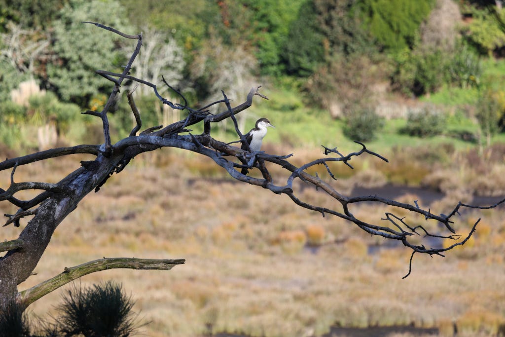
Looking at the image above, I was out chasing autumnal colours, and was distracted by this Pied Shag partially lit by the fading light. I threw on a 400mm lens and repositioned for a clearer view, hoping that the bird would settle long enough to capture something.
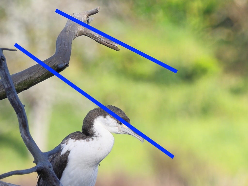
The RAW shots straight out of the camera were all much the same. I eliminated the ones where the bird was looking away, but I couldn’t decide on which of the two remaining images I was going to present. They were both very similar, with the only real difference being the angle of the bird’s head.
It wasn’t until I had the images on my computer that I could see enough detail to make a more informed decision. I spent too long looking at the clarity of the feathers on the bird and trying to determine which image was clearer, or if either of them was.
Through the viewfinder, and on the back screen of the camera, I hadn’t noticed the shaped branch above the bird, and how it mimicked the outline and direction of the bird.
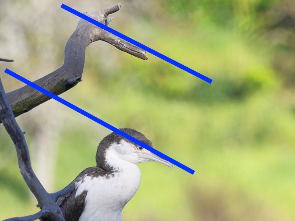
Once I had that detail, it became easier to compare the images. The one where the line of the branch was more parallel with the eyeline of the bird became the one to work with.
The next task was to crop the image to draw more attention to the subject. Using the rule of thirds, I placed the intersection of 2 lines over the bird’s eye, leaving space in front of the bird, another composition guide.
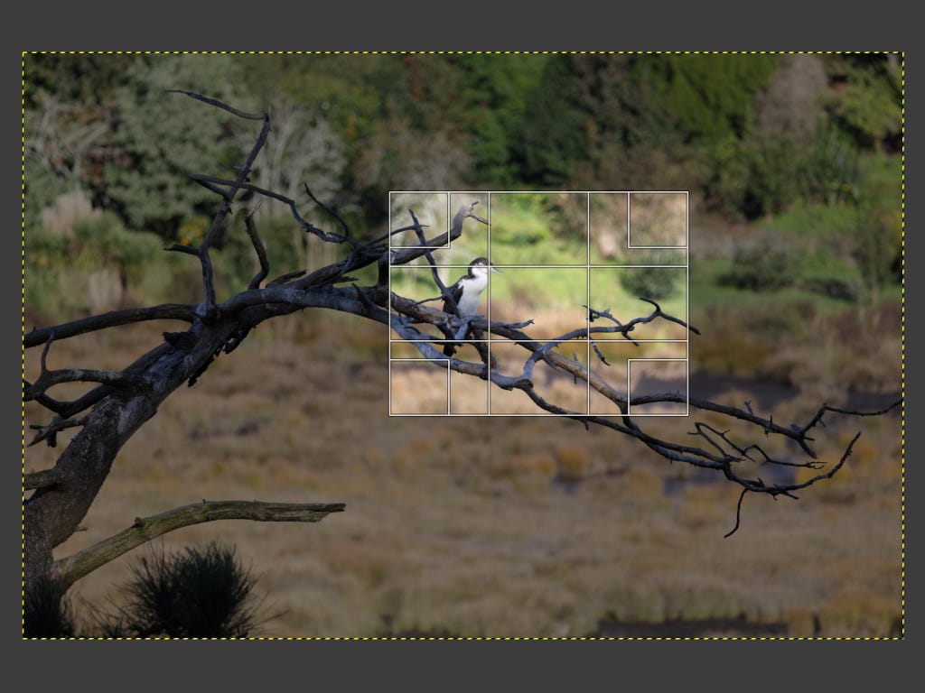
The last step was to lift the shadows slightly and to enhance the greens and yellows just a smidge to help make the subject stand out.
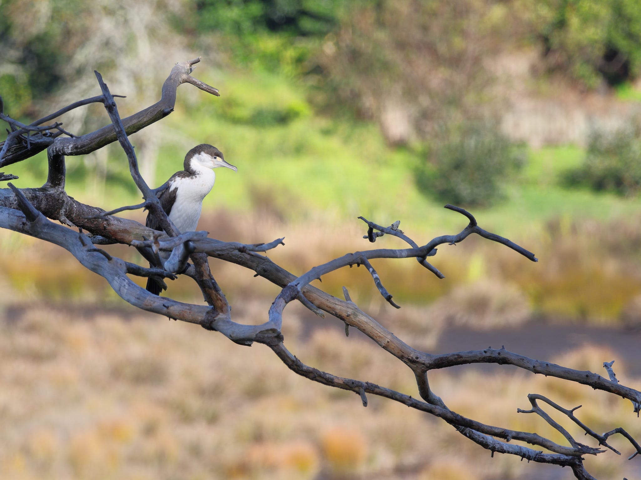
If I had presented the second image, with the non-parallel sight lines, people may not have noticed, especially as they would have had nothing to compare it with.
I guess my conclusion is that while agonising over which image is the better one to present to the world may seem a waste of time, it matters to me.
My audience might not care, but I know in my mind that I have done everything to present the best of my work.
“Details matter. It’s worth waiting to get it right.” - Steve Jobs.
Wishing you good light, open eyes, and moments worth noticing.
Steve.
Thanks for reading.
Subscribe for free to receive new posts.
If this blog resonated with you, pass it on to someone who sees photography as more than just pictures.
Links:
Website: ChuffedBadger Photography
Instagram: ChuffedBadger
Beginners Course: ChuffedBadger on Ko-fi